
HOW TO GET GREAT COLOURS IN YOUR PHOTOS
Have you ever taken a photo and found that the colours don’t look quite how you remembered them? Or maybe you’ve applied a preset in Lightroom and it’s made everything look a bit weird? I’ve got two words for you: WHITE BALANCE. Now I can’t say that sorting your white balance will be the answer to everything, but a really good understanding of it can go along way to solving a lot of your editing woes.

What is white balance?
Simply put, white balance is when you adjust your settings so that the objects that appear white in real life, also appear white in your photos. In photography, the colour of light is talked about in terms of temperature. The measurement used is called “Kelvin”. The human eye is sophisticated enough to quickly adjust to different colour temperatures but our cameras need more help. They need to be told whether the light looks cool (more blue) or warm (more yellow) so they can capture it faithfully. If we don’t do this, we can end up with weird colours or colour casts in our photos. Sometimes we can correct this afterwards but sometimes the white balance will be too far gone to be able to save the photo.
Getting it right in camera
Many photographers shoot with Auto White Balance (AWB) and it works just fine for them. Over the years they may have become so familiar with their camera it’s akin to an additional appendage. One they feel super comfortable with. They know the strength and limitations of their AWB in certain lighting situations and work within those parameters. They might tell you that you don’t need anything except AWB. That’s great if it works for them but if you're having trouble, I’d like to suggest an alternative to AWB.
When you let your camera choose your white balance settings for you, sometimes it will make mistakes. Take snow for example. When you photograph snow with your camera set to AWB, the snow will often look blue. When you use Custom White Balance instead of Auto, you can tell your camera to compensate the blue (with more yellow) to get the white “balance” right. Does that make sense?
I’ve always shot with Custom White Balance. That means I use my eyes to read the colour temperature of the light, then I tell my camera the Kelvin number I think it should be using to effectively make the white things look….white.
Some people find the idea of using custom white balance a bit intimidating but it’s actually really straight forward. I’ve made a free download for you to print and stick somewhere in your home so you can learn the numbers. Once you’re familiar with the numbers, set your camera to Custom White Balance and you’ll be away in no time.

There may be a little tweaking of the numbers as you go and I concede that custom white balance is one more thing to think about before you press the shutter but if you use this as a rough guide and go for it, I swear it’ll make your life easier in the long run.
Getting your white balance right in camera is the key to great colours in your photos. Custom white balance is clearly the route I’m urging you to take, but if you’re still feeling nervous about it, there’s another option. At the very least, you could switch your camera from AWB to one of the semi-automatic white balance settings shown here:
Preset White Balance Settings
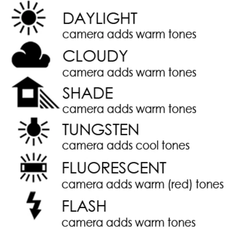
My honest opinion though (if you want it!) is that these settings take just as much thought as Kelvin, so you may as well jump in head first and go for it.
Speed up your workflow
One of the biggest differences that custom white balance makes in my life is the way it speeds up my editing flow when I’m doing client work. If I ever feel tempted to use AWB I notice the difference in the edit. I can be in the same room but one photo will look slightly blue and one will look slightly yellow. This drives me crazy! It makes batch editing/ syncing my settings across a set of photos much harder. It suddenly becomes much more difficult to get a consistent look in an edit. These days, the only time I really use AWB is if I’m in a lighting situation with crazy coloured neon lights.
Pro tip
Using a grey card to set your white balance in post-production is a really precise way to ensure your colours look great, but the down side is that they’re a bit faffy. They need to be used every time the light changes, so if you’re photographing a family outside where the sun keeps popping in and out, it’s just not practical to use one. If you’re working in a studio though where the light is unchanging, this could be a really great option for you.
Do yourself a favour
These days I shoot with the edit in mind. There are certain things I just won’t shoot. In a world of seemingly limitless photo opportunities, having less options can actually be a little bit of a relief. Mixed lighting is one situation I tend to shy away from. If the lights are on (lightbulb yellow) and my daughter is near a window (blue) the mixed colours of these two light sources is going to make it that much harder to achieve good white balance.
Another thing I try to be aware of is colour casts. Standing too close to bright green-leafed trees or bright blue slides is something I try to avoid. The reflected light from these things creates a strong colour cast that’s hard to correct in Lightroom. That’s not to say you need to avoid these things altogether, just try to be mindful of what’s around you and your subject in addition to thinking about what the light is doing. Moving your subject a few steps this way or that can be enough to make a big difference.
Everyone loves golden hour don’t they? Those hazy golden beams of yellow sunshine? Sure, I get it, but that light can play havoc with your colours. If you really want to sharpen your white balance skills, pick a grey day. It’ll give you the best chance of success. Overcast days are are my favourite to really make the most of colour opportunities. Colours just tend to shower truer on a grey day. I’ll make the most of this by hunting for complementary colours or giving a single red toy to my daughter. I love to do this and watch how those colours pop in ways that they don’t when it’s sunny.
Post-production
Ok, so hopefully now you’re thinking about how you can get your WB right in camera (or as close as possible). If you’re doing this, further correcting your WB in Lightroom will now be a lot easier. I made this short video to help you with this next step:
I hope this has been helpful, ask away if you have any questions. My DMs are always open @suziejaygoldsmith
Suzie x